The Challenge
Nutré had built something rare: a meal delivery company that genuinely refused to cut corners. Every meal was made in-house, sourced with integrity, and rooted in a founding story most brands would die for — three brothers who began cooking for their Type 2 diabetic father, only to find their food transforming lives at scale.
But despite a $20M run rate and thousands of devoted members, the brand had buried its best assets. The identity felt soft and anonymous in a category sprinting to the bottom on price, leaving Nutré underarmed against commodity giants and unable to command the premium its quality had already earned.
After
Before
Before
After
The Awakening
Over three months, Emery led a series of deep leadership conversations with Angelo, Lucio, and Valentino — excavating what had always been true but never fully named.
At the center of everything was a single word: Real. Real food. Real ingredients. Real people. Real results. It was the throughline that explained why the brothers became restaurateurs, why they started cooking for their father, and why they have never once substituted quality for margin.
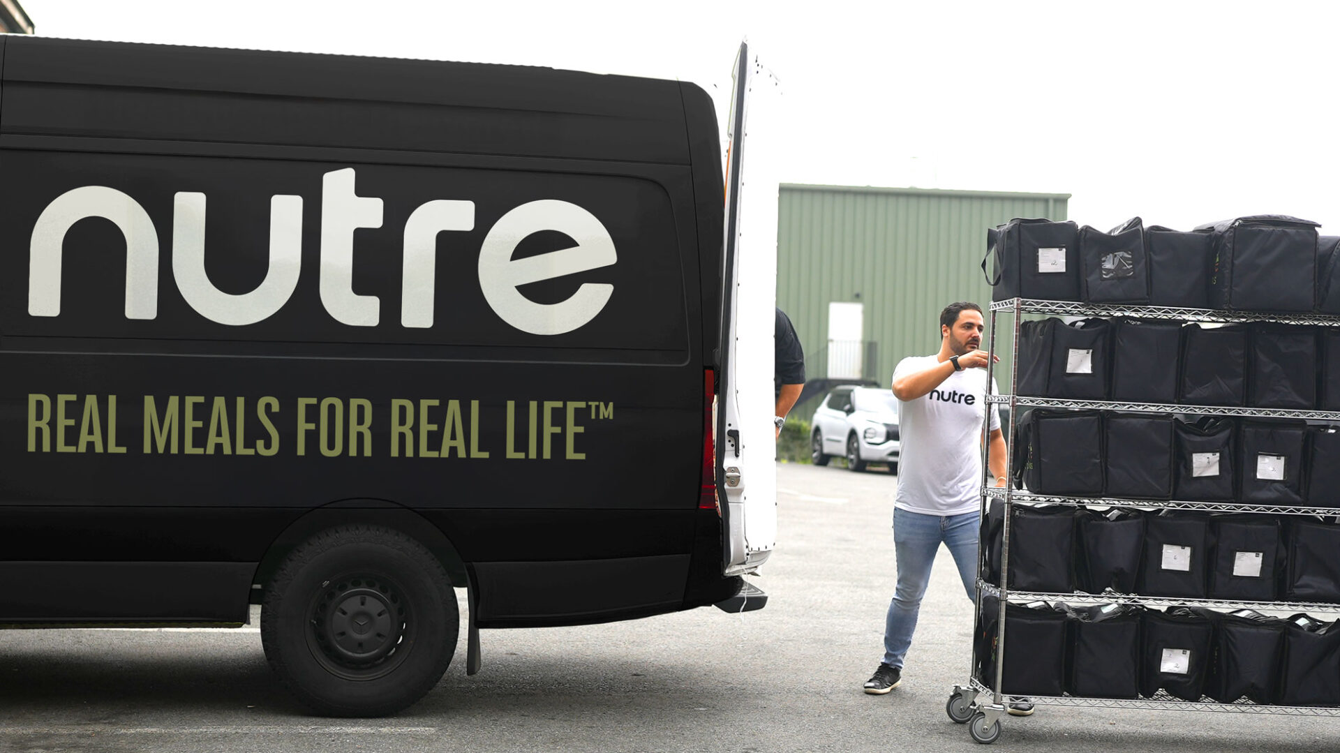
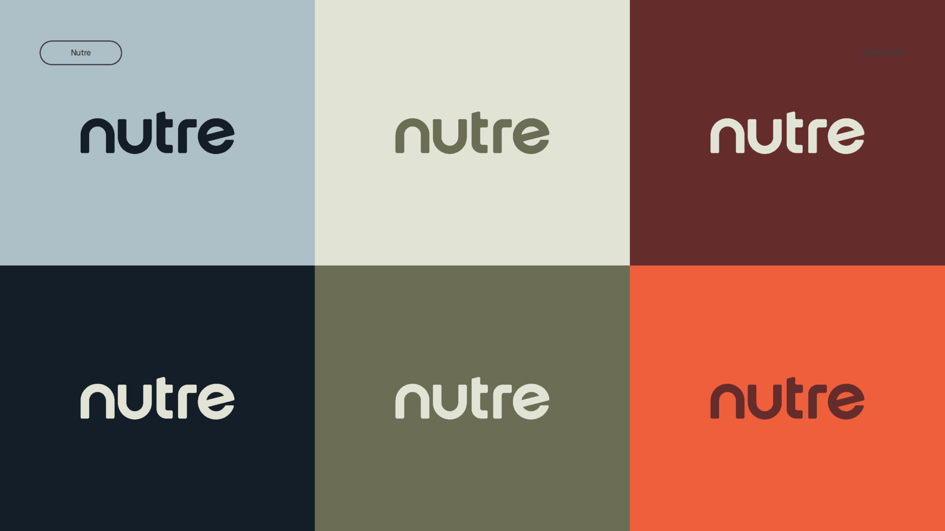
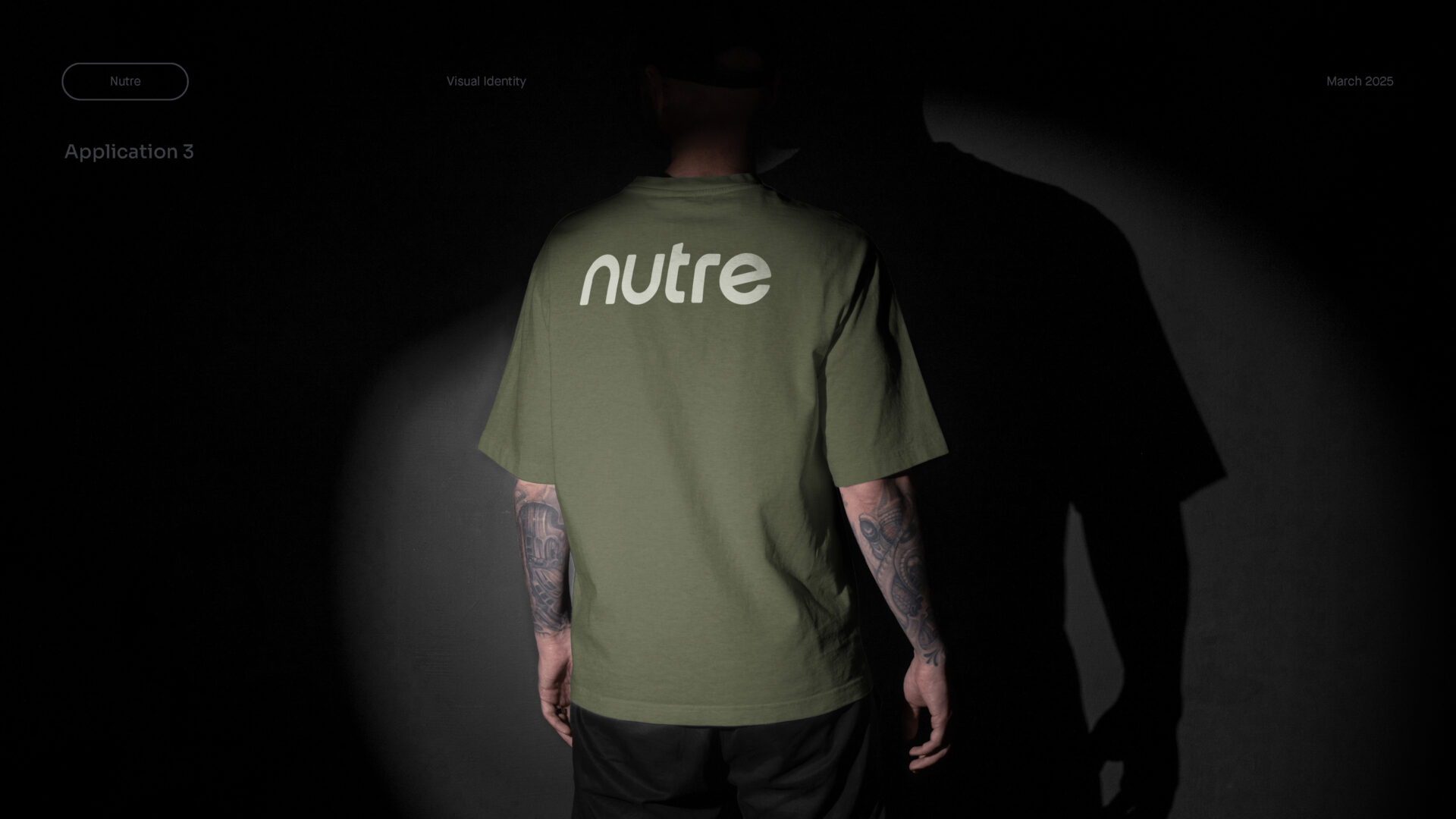
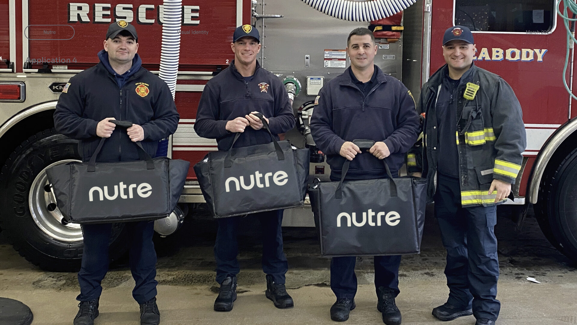
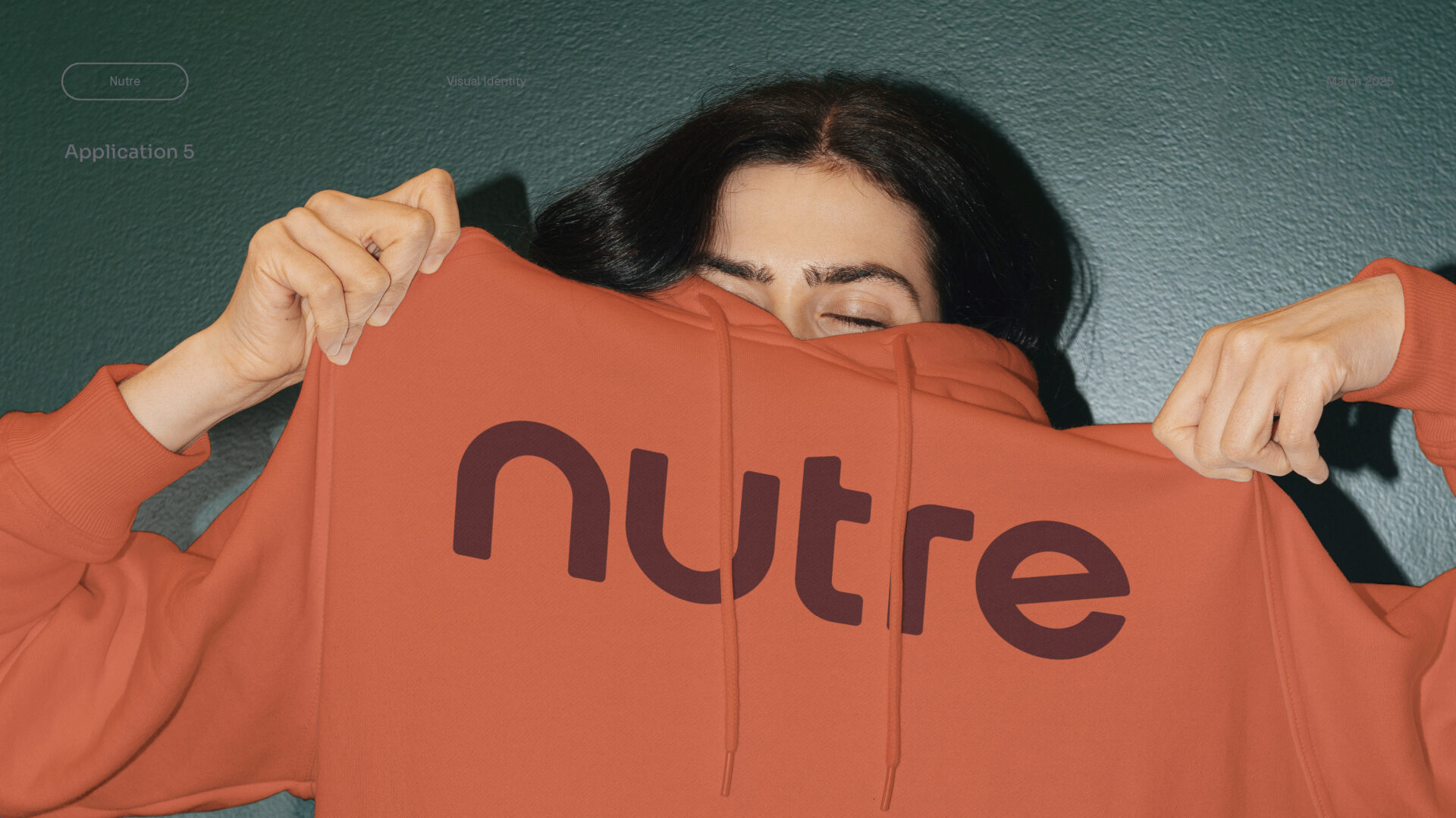
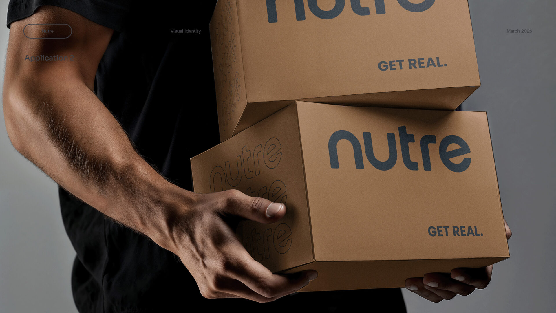
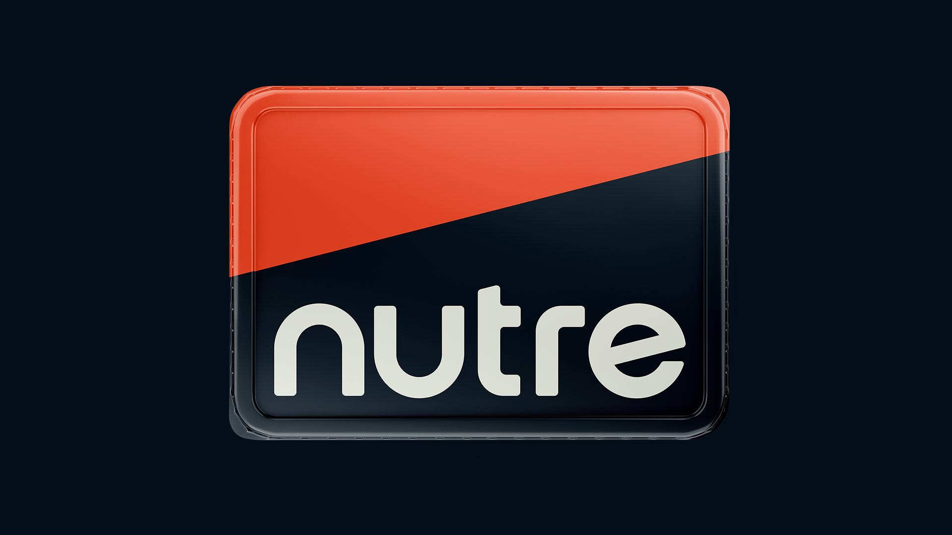
From that foundation, Emery redesigned Nutré's visual identity to match the premium conviction already living in every meal — something members would be proud to wear — and rebuilt the brand strategy around community: a tribe of belief and belonging, not just a subscription.
Logo Marks
Primary Mark
Reverse
Brand Development
The Transformation
Nutré emerged from the process with a brand as uncompromising as its food.
The new identity positioned the company to go toe-to-toe with category leaders, and the renewed emphasis on community gave members something deeper to belong to than a meal plan.
With Real as their north star, the brothers now hold a brand platform built to scale — from new markets and corporate partnerships to grab-and-go retail — without ever losing the family story at its heart.
