The Challenge
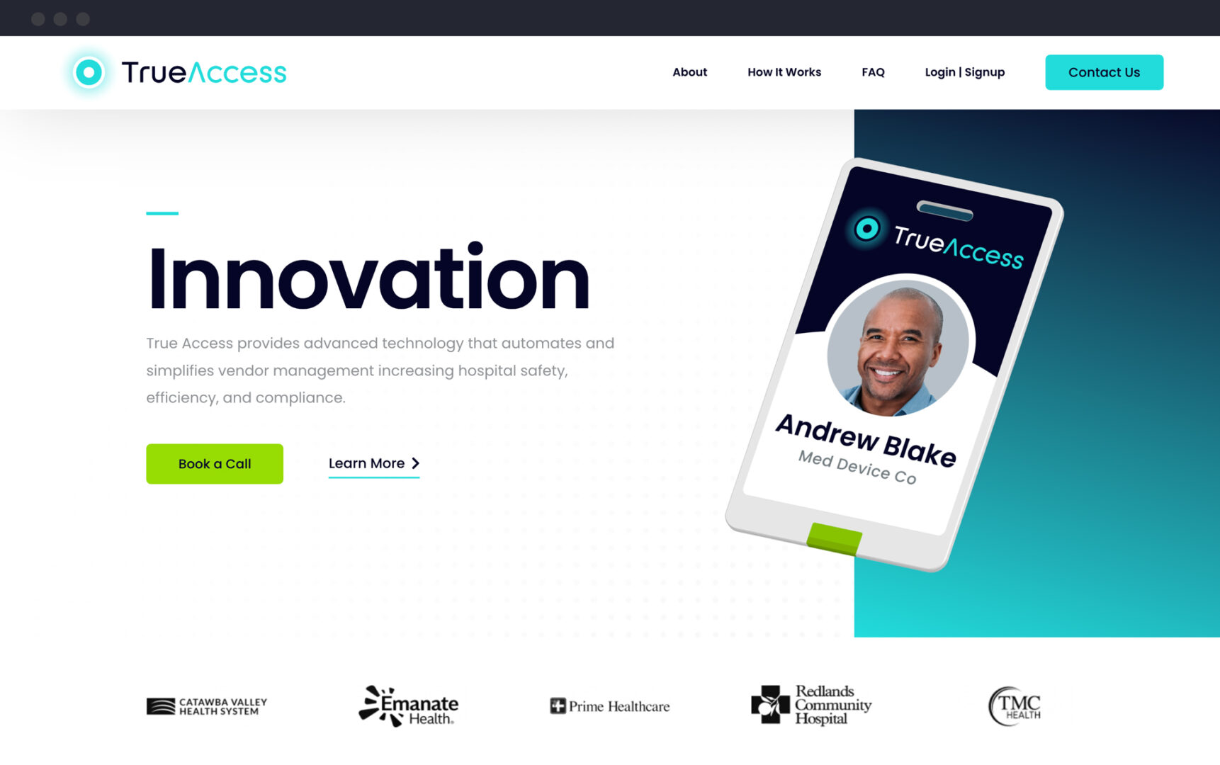
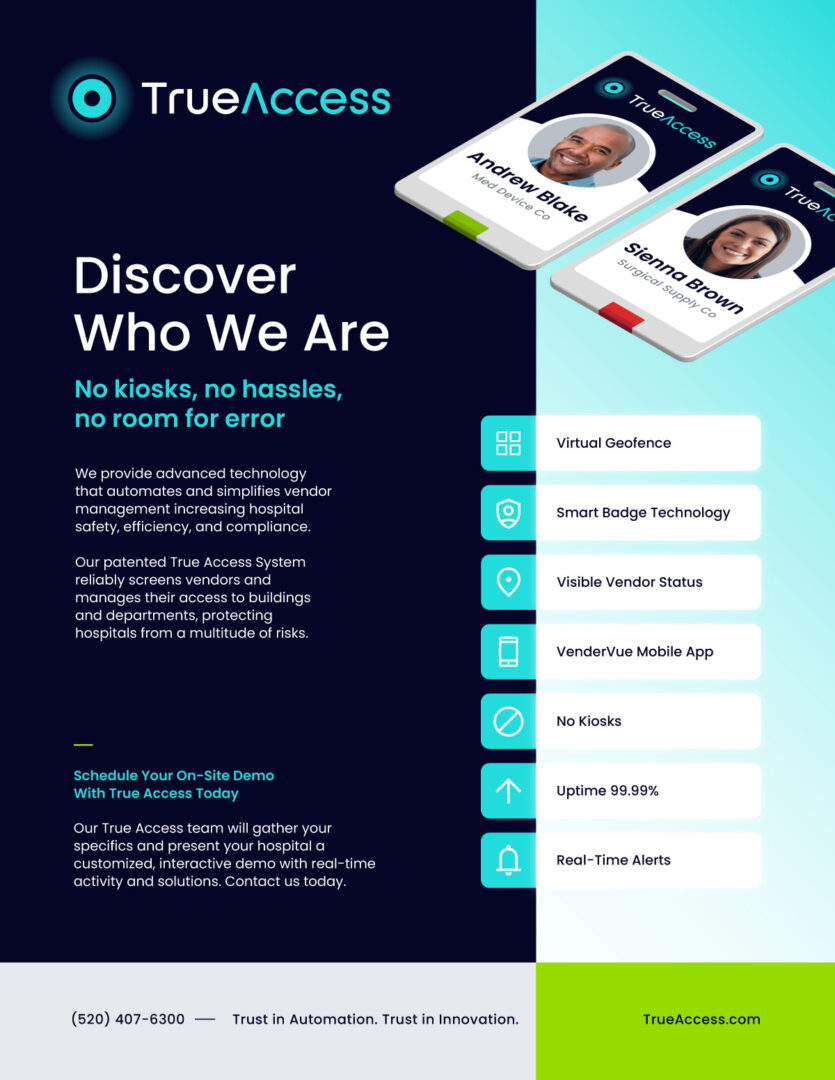
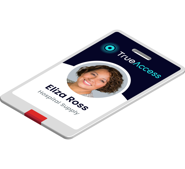
True Access emerged as a promising startup in the bustling world of hospital technology, specializing in vendor credentialing and security. Despite their innovative solutions, their brand lacked the vibrancy needed to stand out, and both their visual identity and website required a revitalization to truly reflect the cutting-edge nature of their offerings.


The Awakening
Our journey with True Access didn't end with the rebranding. As they continue to make inroads into hospitals nationwide, Emery remains by their side, offering ongoing support and strategic guidance. The "Visibility Assures Confidence" ethos now serves as the cornerstone of their brand, propelling them forward as they strive to set new standards in hospital technology and security.
Logo Marks
Primary Mark

Reverse

Color Palette
Primary Palette
Deep Depths
Electric Blue
Calla Lily
Pistachio
Secondary
Deep Shale
Kinder
Warning Red
Bright Gold
Typography
Primary Typeface
Usage
Headlines
Aa
Secondary Typeface
Usage
Subheadings
AaBbCcDdEeFfGgHhIiJjKkLlMmNnOoPpQqRrSsTtUuVvWwXxYyZz 0123456789
Tertiary Typeface
Usage
Body Copy
The Transformation
Our journey with True Access didn't end with the rebranding. As they continue to make inroads into hospitals nationwide, Emery remains by their side, offering ongoing support and strategic guidance. The "Visibility Assures Confidence" ethos now serves as the cornerstone of their brand, propelling them forward as they strive to set new standards in hospital technology and security.
